Can a Color Have a Social Status?
There’s a video floating around from a job we did not long ago. We were filming that day, cameras already out, catching the install as it happened. What we weren’t expecting was Samantha and Chelsea, mid-task, going back and forth about matcha versus coffee.
Neither of them was really arguing about caffeine, though. Anyone who’s spent time around Samantha knows she can’t look at anything for long without it turning into a conversation about color. Watching it back, we couldn’t help but wonder if some part of her had already moved past the drinks to the color underneath: that deep, matte brown against that strange, vivid green. Which one actually reads as expensive.
That’s the part worth sitting with, whether she was conscious of it in the moment or not. We don’t think the video worked because of what was in the cup. We think it worked because of what the color was doing.
The Green Everyone Knows Now
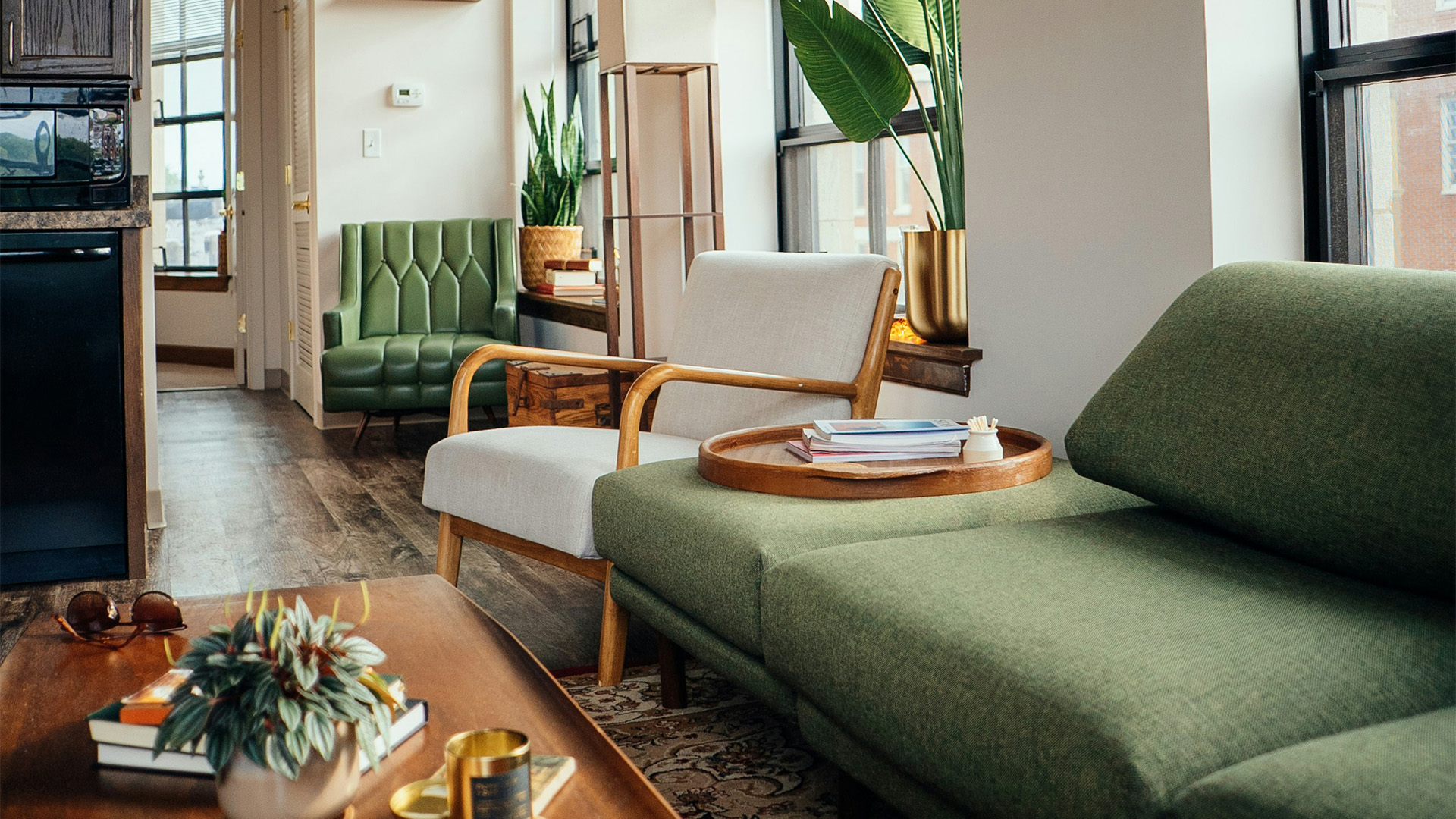
Say “matcha green” to almost anyone and they’ll picture the same shade before they picture the drink. That’s worth noticing on its own. The color got famous first, the beverage rode along behind it.
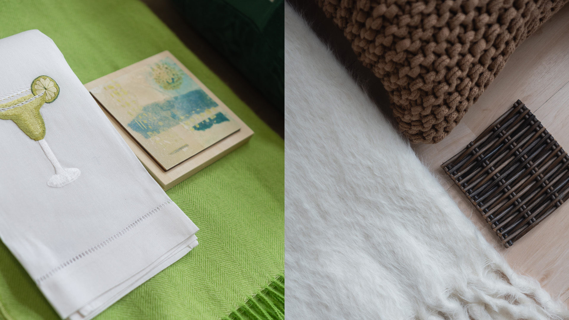
It’s a strange, vivid green, nothing like the muted sage or olive that used to sit in that part of the palette. It’s saturated in a way that photographs well and holds up under bad lighting, built, almost by accident, for a phone screen. And somewhere along the way it stopped just being a color people liked and started being one people used to say something. Health-conscious. Deliberate. Fluent in a certain kind of wellness culture. Nobody had to write that meaning down anywhere. The color just started carrying it.
That’s really the pattern worth naming here, not the tea itself, but how fast a color can pick up a personality once enough people start reaching for it in public.
Is This You Brown?
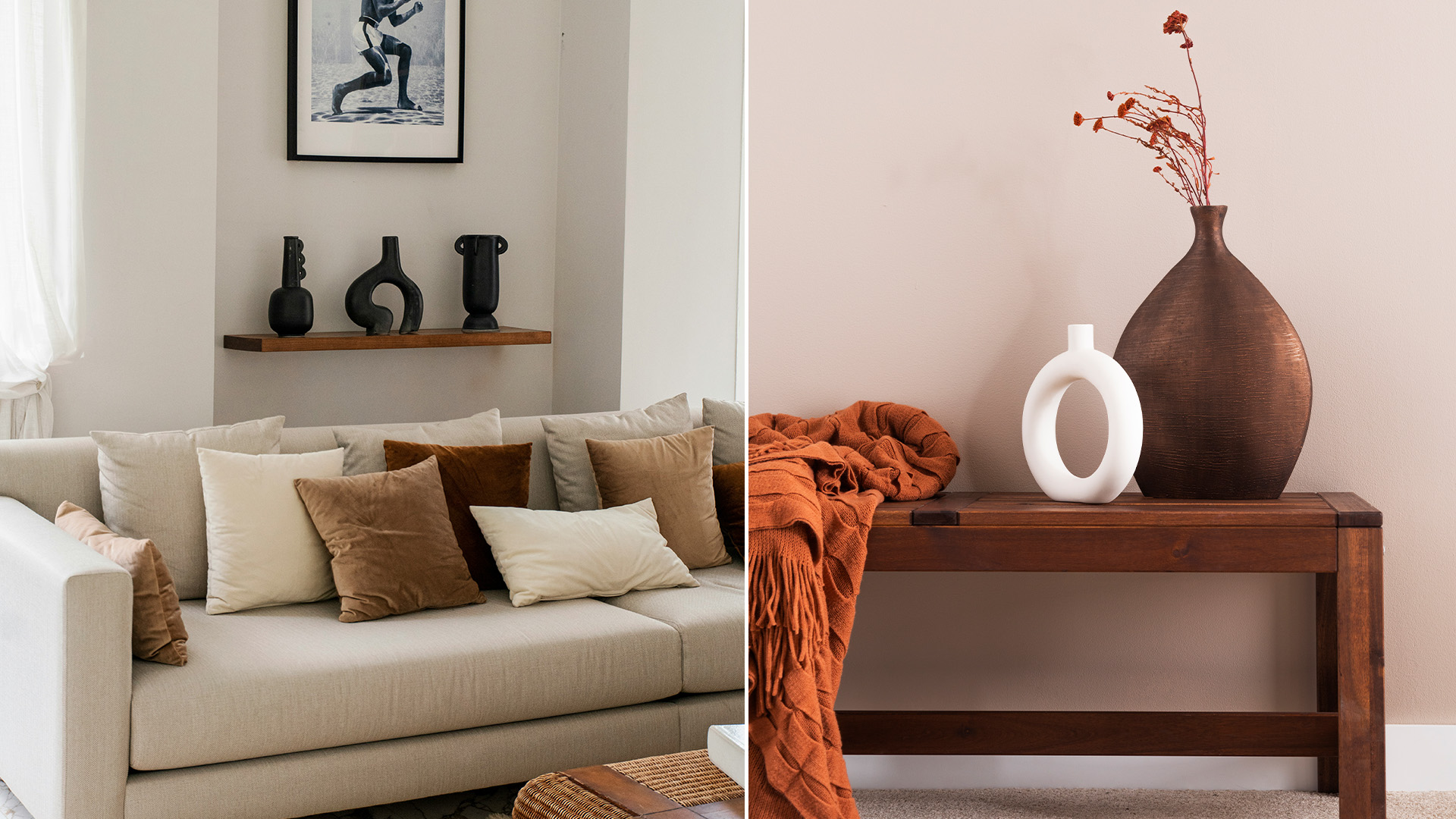
Brown is having a moment too, though it’s a quieter one. It’s not doing its work through phones and feeds. It’s showing up in fabric swatches, in paint decks, in the rooms designers are actually building.
Walk into almost any design conversation this year and chocolate keeps coming up, and not as some ironic throwback either. In a recent industry survey, designers named chocolate brown the color they expect to use most in the year ahead, by a wide margin, roughly double what the same survey found only a few years back. Taupe, cocoa, mole, walnut. All of it getting talked about the way beige used to get talked about: safe, sophisticated, dependable. Except with more warmth in it. The word that keeps showing up next to all of it is “quiet.”
Two Kinds of Status
So here’s where it gets interesting. Matcha and chocolate brown are, in their own ways, both status colors right now. They’re just not signaling the same kind of status, and that difference feels like the actual point.
Matcha wants an audience. Its whole cultural life happened on camera. Choosing it is choosing to be seen choosing it. The status lives in the performance.
Brown doesn’t perform. Nobody takes a photo of a taupe wall expecting it to travel far. Its status works almost in reverse, recognizable mainly to people who already know what they’re looking at. A cognac leather chair or a chocolate linen throw isn’t trying to win over a stranger scrolling past. It’s speaking to someone already fluent in the language.
What Samantha's Been Doing Without Naming It
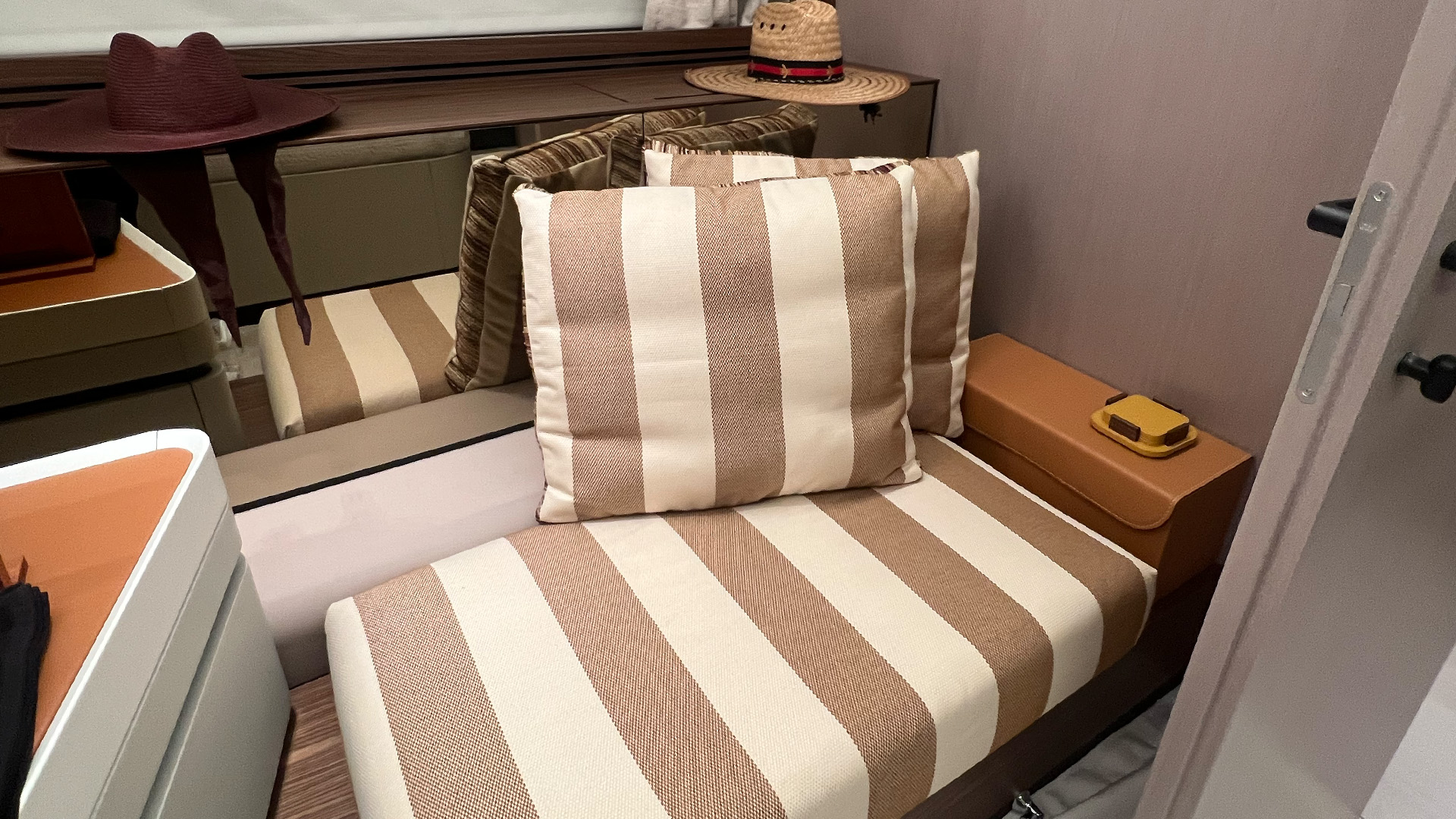
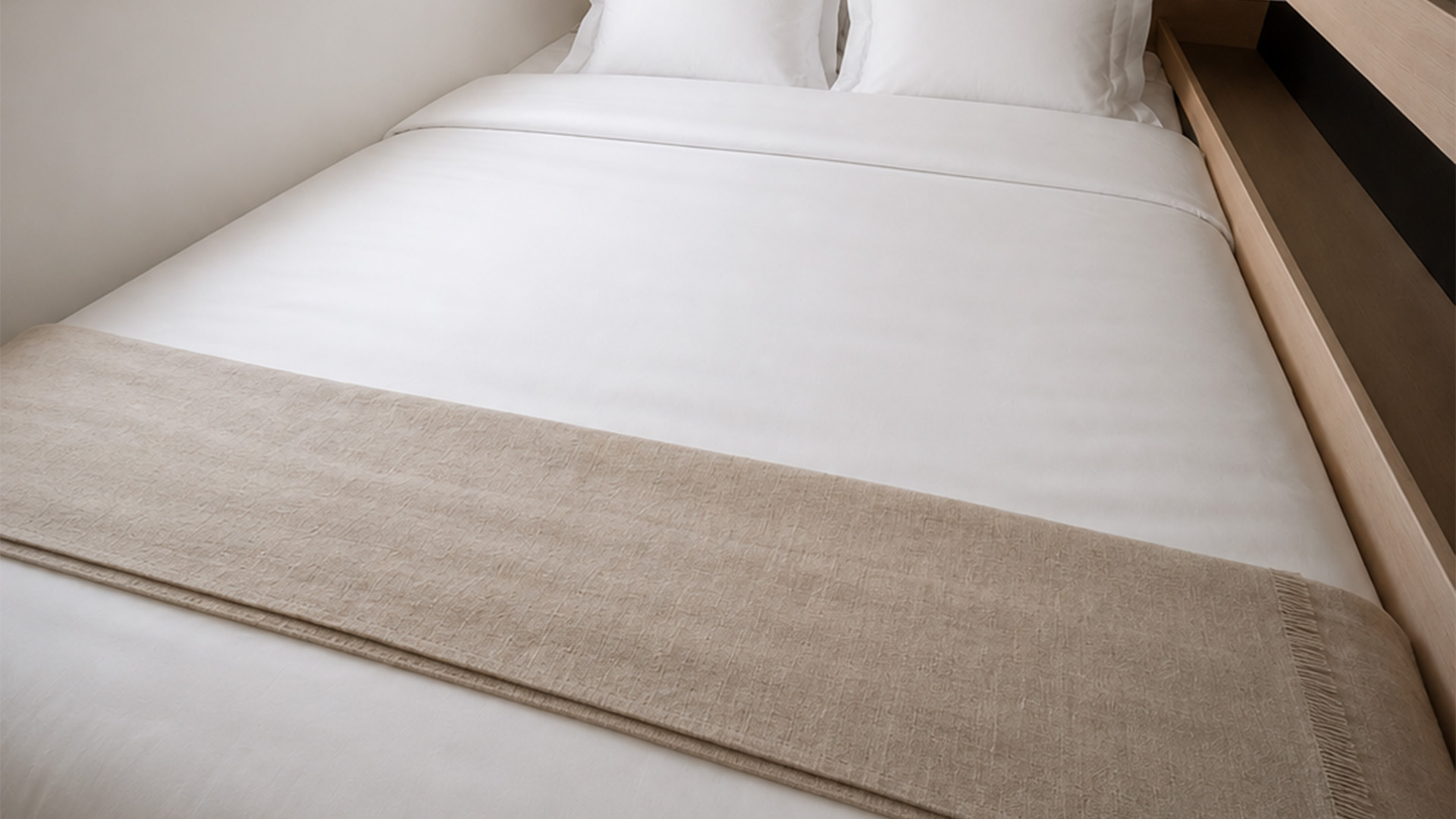
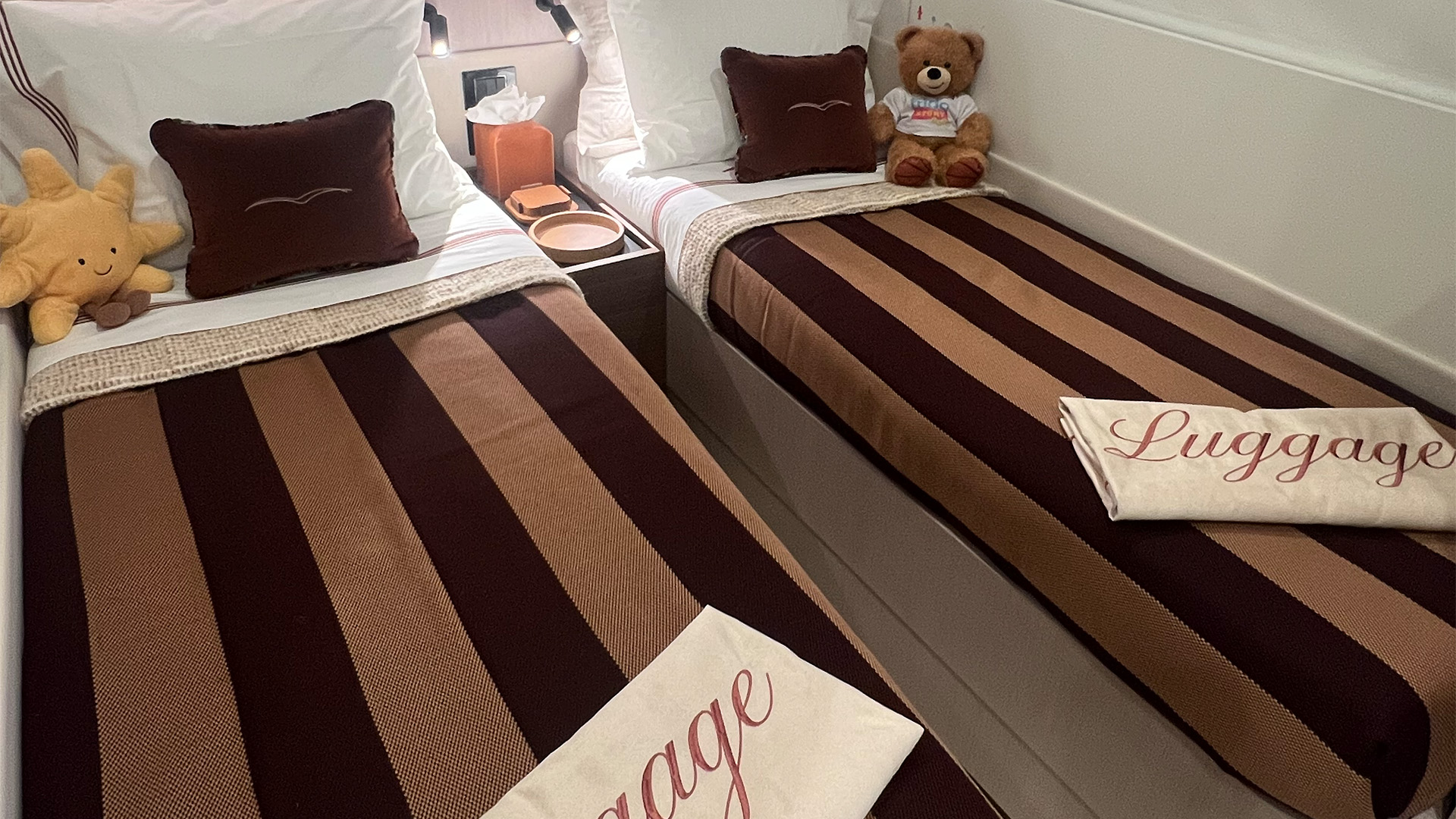
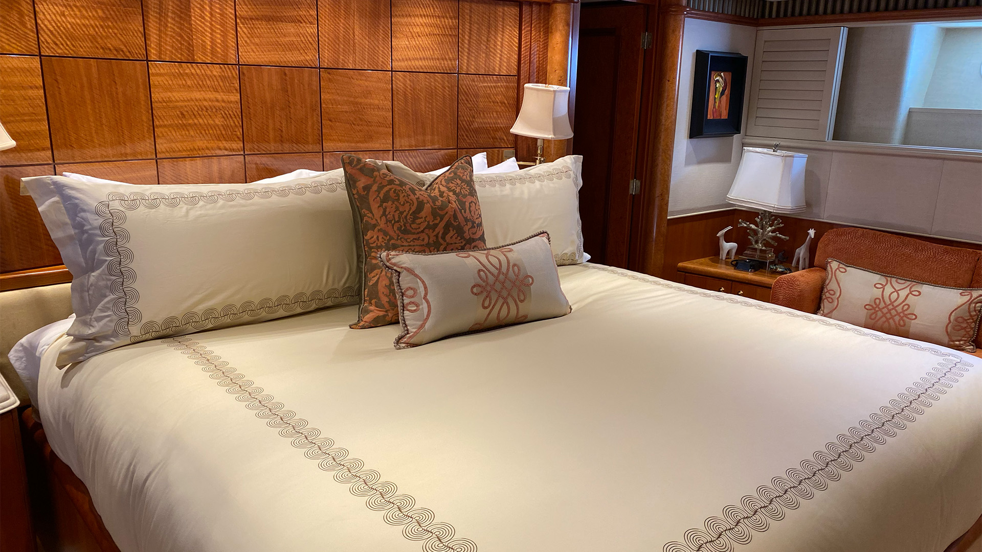
Going back through the last several projects and there it is, again and again. Warm neutrals. Cocoa. Taupe with a little pink underneath it. Not because a trend report said to. That’s not how she works. Nothing here got chosen off just a swatch card at the office. That was done with hands on it (as usual), in the room, deciding what belonged.
So, Can a Color Have a Social Status?
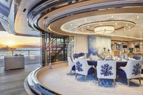
A color doesn’t carry status on its own. Neither does a drink. Status gets attached by who’s using it, how visibly, and why. Matcha’s status is borrowed from a trend cycle that could just as easily move on to something else next season. Brown’s status, at least the way it shows up in a home or on a yacht someone actually lives on, tends to build slower. A person’s taste, tested over years, landing on the same family of tones again and again because it works, not because it’s having a moment.
Maybe that’s the difference worth keeping. One kind of status gets bought into. The other gets built, one project at a time, until a room reads back a hand you already trust.
We didn’t set out to write a color theory piece off an argument about a morning drink. Turns out the argument, or whatever was really happening underneath it, was worth having.
Sources
- 1stDibs, 2026 Interior Design Trends Survey — chocolate brown named top color designers anticipate using in 2026, cited by roughly a third of respondents.
- WellCalm, “How has matcha become a social symbol instead of coffee?” — on matcha as a signal of wellness-oriented, deliberate lifestyle choices.